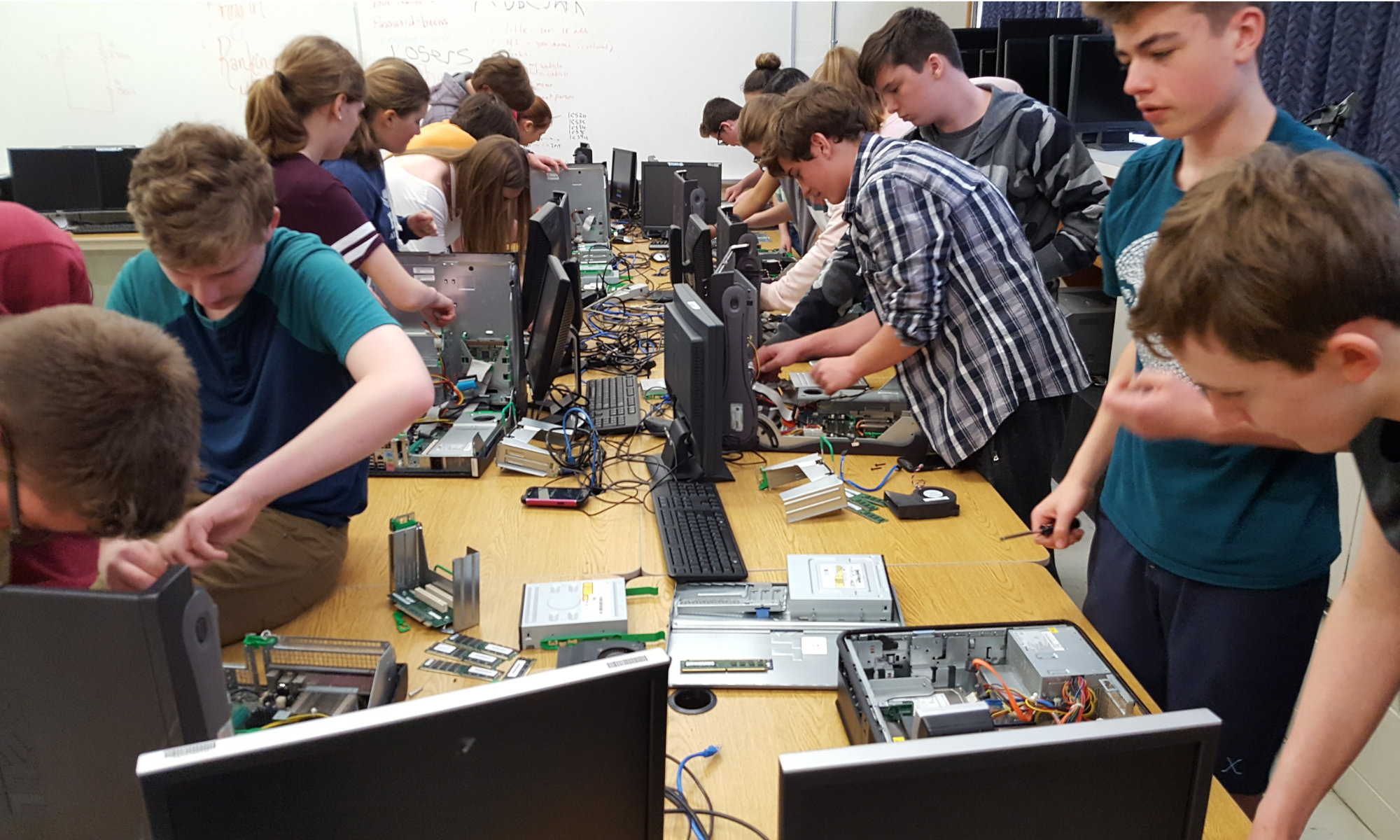
At the end of this semester I asked the Communications Technology students to share which Affinity Designer tutorials were their favourites and why.
Following are their responses.
Creamsicle Vector
https://bit.ly/2FBzSbl
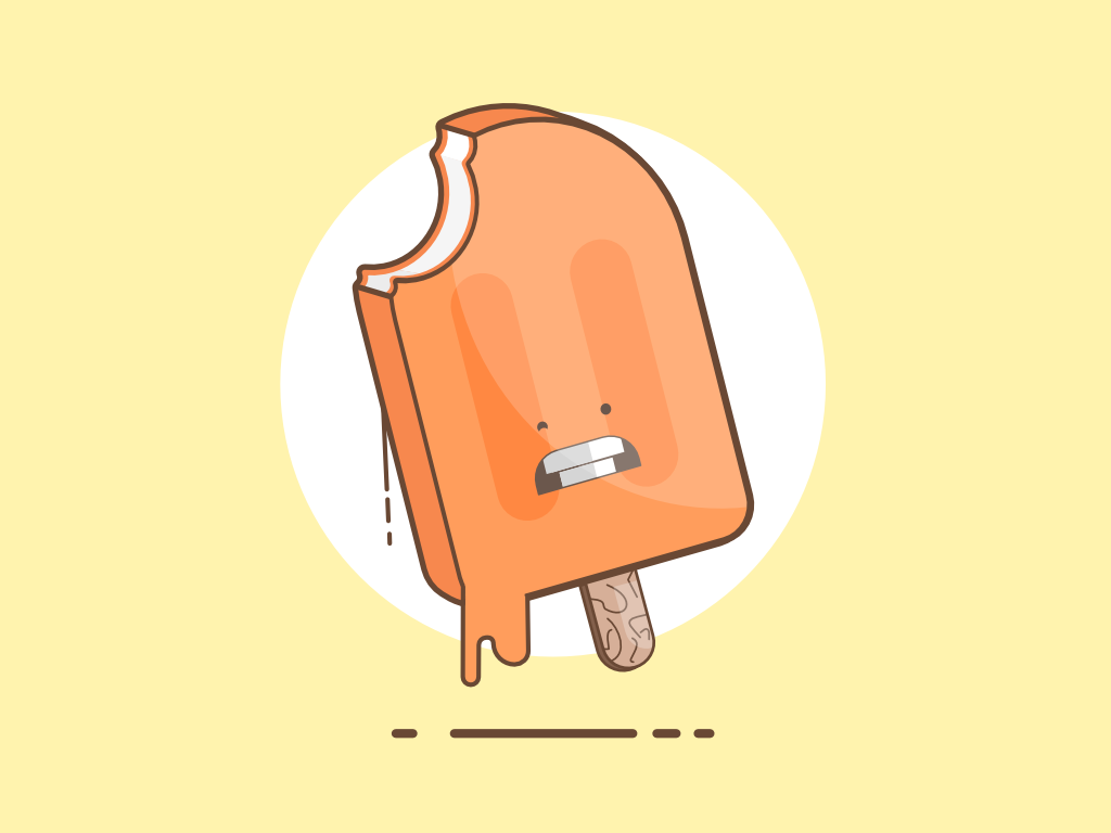
This was one of the tutorials that I found on my own, and I really enjoyed it. It was a fun tutorial that involved using a lot of basic tools in different ways to create a fun illustration.
Some of the skills used were masking, subtracting, changing stroke size, and changing fill opacity.
Retro Tutorial
https://bit.ly/2JSy93I
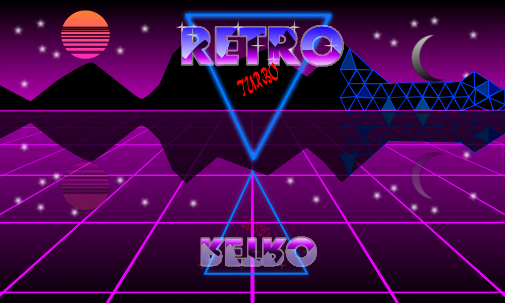
I enjoyed this tutorial as it involved a little bit of everything and taught me about reflections and node tools. It also got me to experiment with different tools and techniques.
I also learned the importance of grouping as it becomes very messy when there are 20 different lines and none were labeled.
Cute Rooster
https://bit.ly/2JVi1yJ
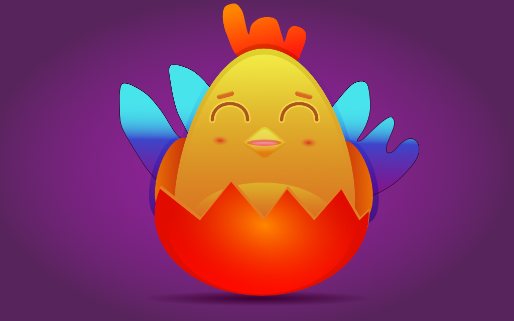
I enjoyed this tutorial because the end result turned out good and the instructions weren’t complicated. The tutorial also allowed you to customize your rooster to fit the theme that you want, not just Chinese New Year.
This tutorial taught me how to make advanced shapes using the pen tool. It also taught me why I need to group my layers together.
Flat Design Castle
https://bit.ly/2QUfpAw
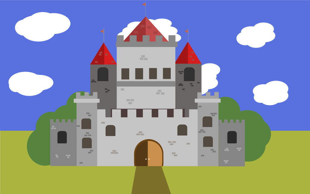
This tutorial was one that I found. I liked it because of it’s symmetry and simple style. I liked it because it allowed freedom but also wasn’t very vague in it’s instructions, it struck a good balance between the two.
Some of the skills learned were Duplication of vectors and how to make things look like they have value.
Volkswagen Van
https://goo.gl/nwnN5i

I really liked and enjoyed this tutorial for a couple of reasons. One, it was a super fun tutorial to follow and complete. Two, it really challenged you at some points. Three, it was a fun tutorial to follow and I had a great time doing it!
Also, I learned new techniques for the program which were very cool for me.
How to Create Patterns
https://bit.ly/2CqJnXq
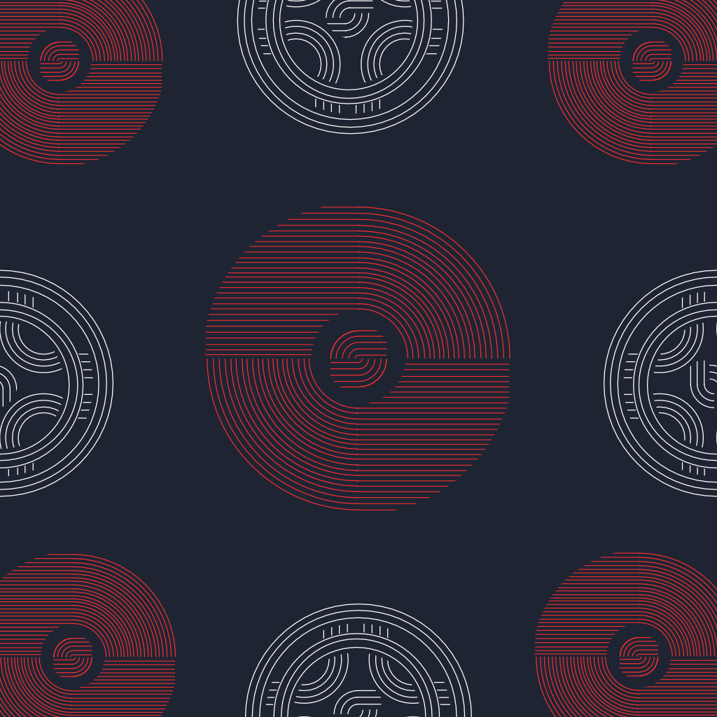
I really liked this tutorial because it was very easy to follow. It was very clear and concise. It also looks really cool and complicated to make when in reality it was very simple. From this tutorial I needed a lot of patience, there was lots of little lines and very exact spacing measurements I needed to follow.
Python Trace
https://bit.ly/2HIIZEt
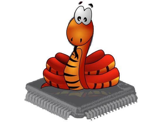
The video does a very good job on explaining on how to do the tracing but after showing you how to do one part of the snake it skips forward to coloring.
This Tutorial is very enjoyable but very tedious because there is a lot of repeating work but the enjoyable stuff is that you can customize the colors and stripes however you want and the finished project that comes out looks really nice.
Captain America Shield
https://bit.ly/2sUUPqt
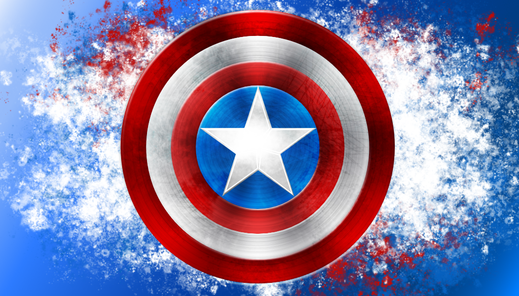
I enjoyed this tutorial because it used a wide variety of skills and showed off the many parts of Affinity Designer while showing you a tangible way to use all of them.
Some skills I used include using different types of layers and how to use the pixel persona in Affinity Designer.
Festive Christmas Fireplace
https://bit.ly/2HLlv1o
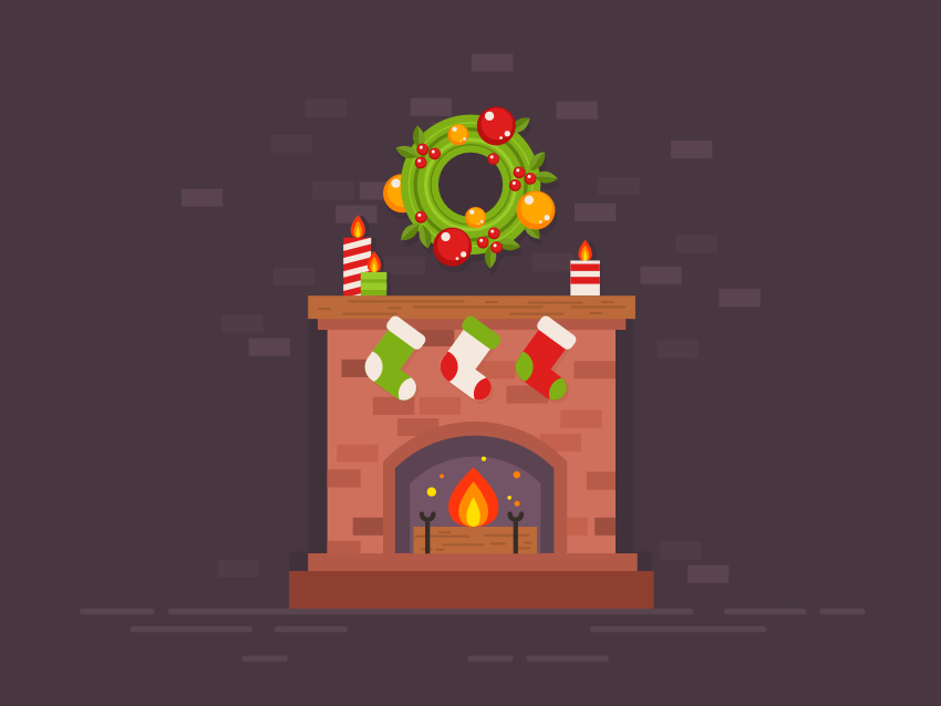
I liked this tutorial because it was the most interesting out of all the tutorials and it didn’t take that long to make and it helped that the program was so good and it made is way easier and learning how to use it and fix my mistakes.
For those that don’t know about Affinity Designer, it’s what I’ve started using in class as an alternative to Adobe Illustrator. I just can’t substantiate paying Adobe’s ridiculous subscription fees when there is a fantastic and just as capable alternative available for a one-time fee of just $50 US.
See https://affinity.serif.com/en-gb/designer/ for details.
